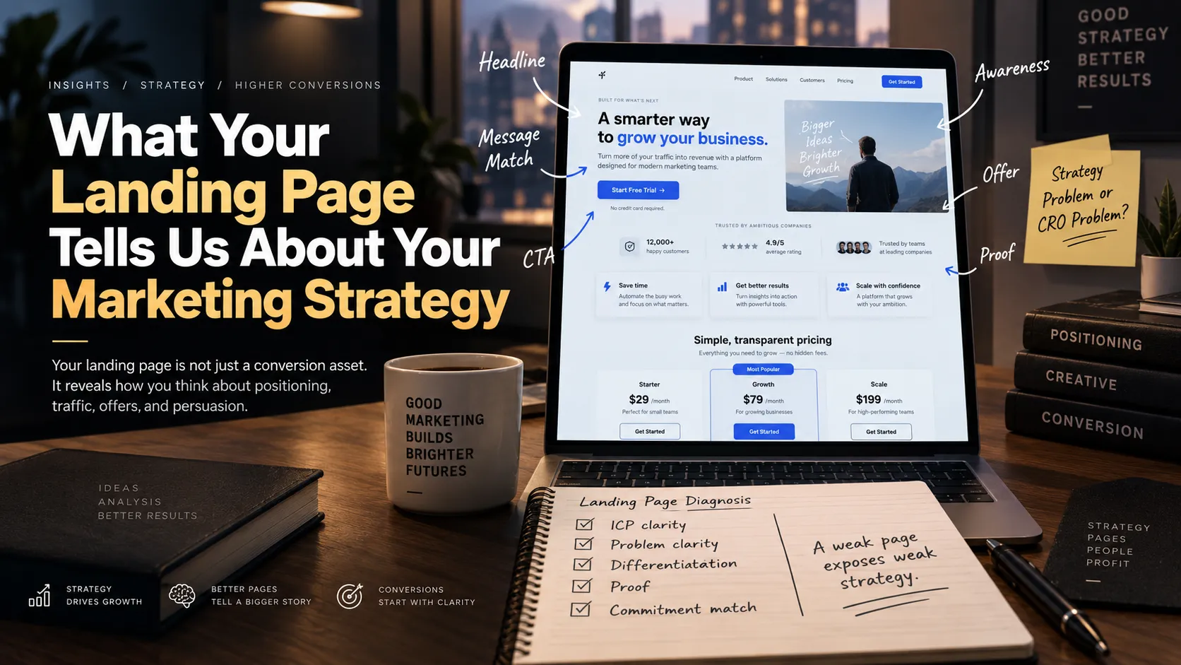
Most landing page critiques stop at the surface: fix the headline, add testimonials, move the CTA, redesign the hero. These things matter. But they’re usually downstream symptoms, not the actual diagnosis.
An experienced strategist looking at a landing page isn’t really asking “is this well designed?” They’re asking a bigger question: what does this page reveal about how this company thinks about growth?
Your landing page is the visible output of dozens of invisible marketing decisions. It shows who you think the customer is, what you believe will persuade them, how differentiated your offer really is, what awareness level your traffic actually has, and whether your advertising and conversion strategy are even telling the same story. A weak landing page is rarely just a CRO problem. It’s often a strategy problem that finally became visible.
The page is not just where traffic converts. It is where your marketing strategy becomes visible.
The Headline Reveals Whether You Understand the Problem
The headline is usually the fastest read on positioning quality. Weak headlines describe the company, the product, or a vague benefit — internal language dressed up as a pitch. “An All-in-One Growth Platform for Modern Businesses” tells you what the company wants to say. “Turn More of Your Existing Website Traffic Into Qualified Sales Calls” tells you what the customer urgently wants solved.
The first is inside-out marketing. The second implies a clear ICP, a clear pain, a clear outcome, and a clear conversion objective. The question worth asking of any headline: does this page begin with what the company wants to say, or with what the customer wants solved?
Product-Led vs. Customer-Led
Product-led messaging says, “here’s what we built.” Customer-led messaging says, “here’s what’s happening in your world, why it matters, and how we help.” Pages overloaded with features, specifications, integrations, and company history often reveal an assumption that visitors already understand why the product matters.
That assumption can be correct — for highly product-aware traffic, feature-forward pages work fine. It fails badly when the audience still needs the problem, the category, or the value explained from scratch, which is a large share of most brands’ actual traffic.
The Page Reveals the Awareness Level You’re Marketing To
Eugene Schwartz’s five stages — unaware, problem aware, solution aware, product aware, most aware — determine how much a page needs to explain before it can ask for anything. A page built for most-aware traffic can be short, offer-heavy, and promotion-driven. A page for problem-aware traffic needs problem education, a mechanism, proof, and real objection handling before an offer will land.
Most brands run one generic page for every visitor regardless of how they arrived — which means it’s simultaneously too much for the ready-to-buy visitor and not nearly enough for the skeptical one. When the page assumes more awareness than the traffic actually has, conversion falls — not because the offer is weak, but because the argument required to support it was never made.
Does Your Traffic Strategy Match Your Conversion Strategy?
This is where a lot of acquisition budget quietly leaks. An ad says: “Why your Meta Ads stop scaling after $500/day.” The landing page it sends traffic to says: “We are a full-service digital marketing agency.” The click was earned by one specific problem. The page then asks the visitor to process an entirely different proposition — and the visitor, understandably, leaves confused about whether they’re even in the right place.
The consequences compound: confusion, lower conversion rate, reduced trust, and — because acquisition is a closed system — higher CAC. A strong ad creates momentum. A weak landing page resets the conversation.
Think of this as creative-to-landing-page continuity: Ad Hook → Problem → Promise → Mechanism → Proof → Offer → CTA. The page’s job is to continue the argument the ad started, not open a new one.
Does the Offer Survive the Screenshot Test?
Vague pages usually expose vague offers. “We help businesses grow.” “Full-service digital marketing.” “Premium skincare powered by science.” “AI-powered productivity.” These are categories, not propositions — they describe an industry, not a reason to choose this specific company within it.
A genuinely differentiated page makes clear who it’s for, what specific problem it solves, what outcome it creates, and how it works differently — well enough that differentiation should survive the screenshot test: if someone screenshots only the hero section and crops out the logo, could they still tell which company it belongs to? If not, the positioning is probably too generic to be doing real work.
Does the Page Understand the Objections?
Objections go missing from a page for one of two reasons: either the team assumes the buying decision is simpler than it actually is, or they’ve never done the research to know what’s actually holding people back. A strong page shows it already knows what the visitor is silently asking: will this work for me? Why should I trust you? Why now? What happens if it doesn’t work? Is this worth the price? Why switch from what I’m already using?
Objection handling is customer research made visible. A page that ignores the obvious objections isn’t being concise — it’s revealing that nobody on the team has spent enough time actually listening to prospects.
What Kind of Proof Does the Page Rely On?
Not all proof carries equal weight. A testimonial that says “Great service, highly recommended” reveals almost nothing. A testimonial structured as before → problem → intervention → result does real persuasive work, because it walks a skeptical reader through a change they can imagine happening to themselves.
Weak proof — logos with no context, five-star ratings with no specifics, vague praise — often signals a brand that’s been collecting validation rather than building evidence. Proof should reduce uncertainty, not decorate the page.
Features vs. Outcomes
“AI-powered automated reporting” is a feature. “Know exactly where revenue is leaking without spending Monday morning building spreadsheets” is an outcome. “48-hour battery life” is a feature. “Go through an entire weekend without looking for a charger” is an outcome.
A feature only persuades once the reader understands why it matters to them specifically — which requires walking the full chain: feature → mechanism → benefit → outcome → emotional relevance. Pages that stop at the feature are leaving the persuasive work half-finished and hoping the reader fills in the rest themselves. Most won’t.
Perceived Value and the Cost of Inaction
A page can clearly state what the product is and what it costs while completely failing to establish why the problem is expensive, why the outcome is valuable, or why now is the moment to act. That’s a value communication problem, not a price objection — and the two get confused constantly. A strong page widens the gap between the value of the desired outcome and the perceived cost or risk of acting on it.
Most pages also only describe the upside of buying and skip the downside of doing nothing. “Improve your website conversion rate” is weak. “If you’re spending $50,000/month on traffic at a 1.5% conversion rate, even a small conversion lift can change your acquisition economics without increasing media spend” creates real urgency, because it attaches a number to inaction — no artificial scarcity required.
Commitment Should Match Conviction
A CTA mismatch is one of the most common — and most overlooked — sources of drop-off. “Start Free Trial” is reasonable for a high-awareness visitor. “Book a Demo” can feel like too large an ask for cold, skeptical traffic. For high-ticket services, “Get a Strategy Audit” often bridges the gap more logically than a hard pitch would.
Commitment should match conviction. The stronger a visitor’s belief by the time they reach the CTA, the larger the ask can reasonably be. CRO isn’t about making the button louder — it’s about making the next step feel psychologically reasonable given how much persuasion actually happened before it.
Page Length Is a Complexity Signal, Not a Style Choice
“Short pages convert better” and “long-form always wins” are both wrong as universal rules. The correct length is determined by how much persuasion the decision actually requires. High awareness, a simple offer, and low risk need very little explanation. Cold traffic facing an unfamiliar solution, a higher price, and real perceived risk needs considerably more.
The page should be as long as the buying decision requires — and no longer. Length is a downstream decision, not a starting principle.
Sequencing Matters More Than Ingredients
Many pages contain all the right elements — problem, proof, offer, objection handling — arranged in the wrong order. Asking for the sale before enough belief has been built is a common failure mode even on pages with genuinely strong individual sections.
A reasonable default sequence: Problem → Stakes → Desired Outcome → New Mechanism → Solution → Differentiation → Proof → Objection Handling → Offer → Risk Reduction → CTA. Conversion is often a sequencing problem disguised as a copywriting or design problem.
Specificity Reveals Research Quality
“Scale your business with confidence” could belong to almost any company in any category. “You’re generating leads. The problem is half of them wait six hours before anyone follows up” could only have come from someone who’s actually looked closely at how the customer’s business runs.
Specific copy usually comes from specific research. Generic copy usually comes from assumptions. The presence or absence of concrete, real-world detail on a page is one of the more reliable tells of whether anyone talked to an actual customer before writing it.
The Page Explains Why Your Ads Are Getting Expensive
CRO and paid acquisition are the same system viewed from different ends. If the creative earns the click but the page converts poorly, more clicks have to be purchased to produce the same number of customers. At a $2 CPC and 10% conversion rate, CAC lands at $20. At the same $2 CPC with a 5% conversion rate, CAC doubles to $40 — without the auction becoming any more competitive and without the media buyer doing anything differently. The conversion layer simply became less efficient, and the cost showed up one step removed from where the actual problem lives.
CAC is a system metric. Creative, media buying, offer strength, and landing page performance all feed into it, which is exactly why a rising CAC so often gets misattributed to the wrong layer of the funnel.
A High Converting Page Can Still Hide a Weakness
Worth a caveat: a page can convert well for reasons that have nothing to do with its own persuasive strength — heavily retargeted traffic, existing brand demand, aggressive discounting, an already-aware audience. None of that proves the page can convert cold, unfamiliar traffic at the same rate.
Conversion rate without traffic context can be misleading. A 10% conversion rate from branded traffic and a 3% conversion rate from cold traffic aren’t directly comparable, and treating them as if they are leads to false confidence right up until a business tries to scale into new, colder audiences and the page quietly fails to keep up.
A Landing Page Strategy Diagnostic
A page can be evaluated against twelve questions that go well beyond conventional CRO: Is it immediately clear who this is for? Is the customer’s real problem obvious? Is the transformation tangible? Does the page continue the conversation the ad started? Is there a clear reason to choose this over alternatives? Does the visitor understand why the solution works? Does the proof actually reduce uncertainty? Are the strongest objections addressed? Is the offer compelling enough to justify action? Does the CTA match the visitor’s level of conviction? Is the page written for the awareness level of the traffic actually arriving? And, taken together, does the entire page tell one coherent persuasive story?
These aren’t isolated CRO checkboxes. Together, they reveal the quality of the strategy sitting upstream of the page.
The Page Sits Inside a Larger System
A landing page should never be built in isolation. It’s one link in a longer chain: Customer Research → Positioning → Offer Strategy → Creative Strategy → Traffic → Landing Page → Conversion → Sales/Checkout → Retention. The page is where strategy, creative, traffic, and conversion finally collide — which is exactly why a page built without the upstream work in place tends to look fine in isolation and still fail to convert.
The Real Diagnosis
When a landing page isn’t converting, the instinct is to change the headline, add testimonials, swap the CTA, redesign the hero. Sometimes that’s enough. But the more useful questions sit further upstream: are we talking to the right customer? Are we solving a problem they actually prioritize? Is the offer genuinely differentiated? Does the ad’s promise match what the page delivers? Are we asking for more commitment than the visitor’s current belief supports? Have we actually built enough belief to earn the ask we’re making?
Your landing page doesn’t just tell us how well you understand CRO. It tells us how well you understand your market.
A weak landing page is rarely just a design problem. It’s a strategy problem that finally became visible — and your ads reveal how well you earn attention, while your landing page reveals what you actually do with it once you have it.